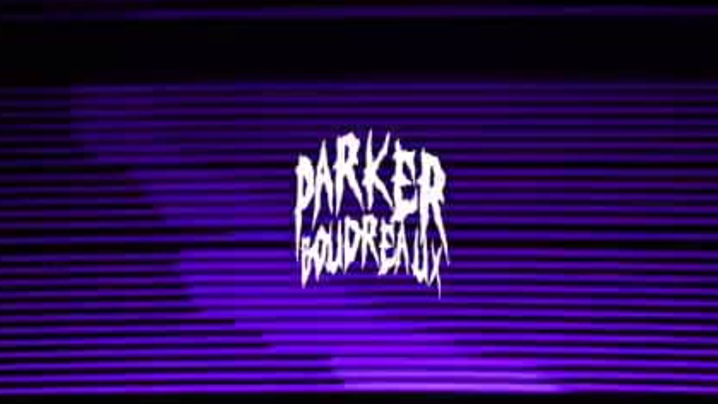
D y n a m i t e P i c t u r e s | 2 0 2 2
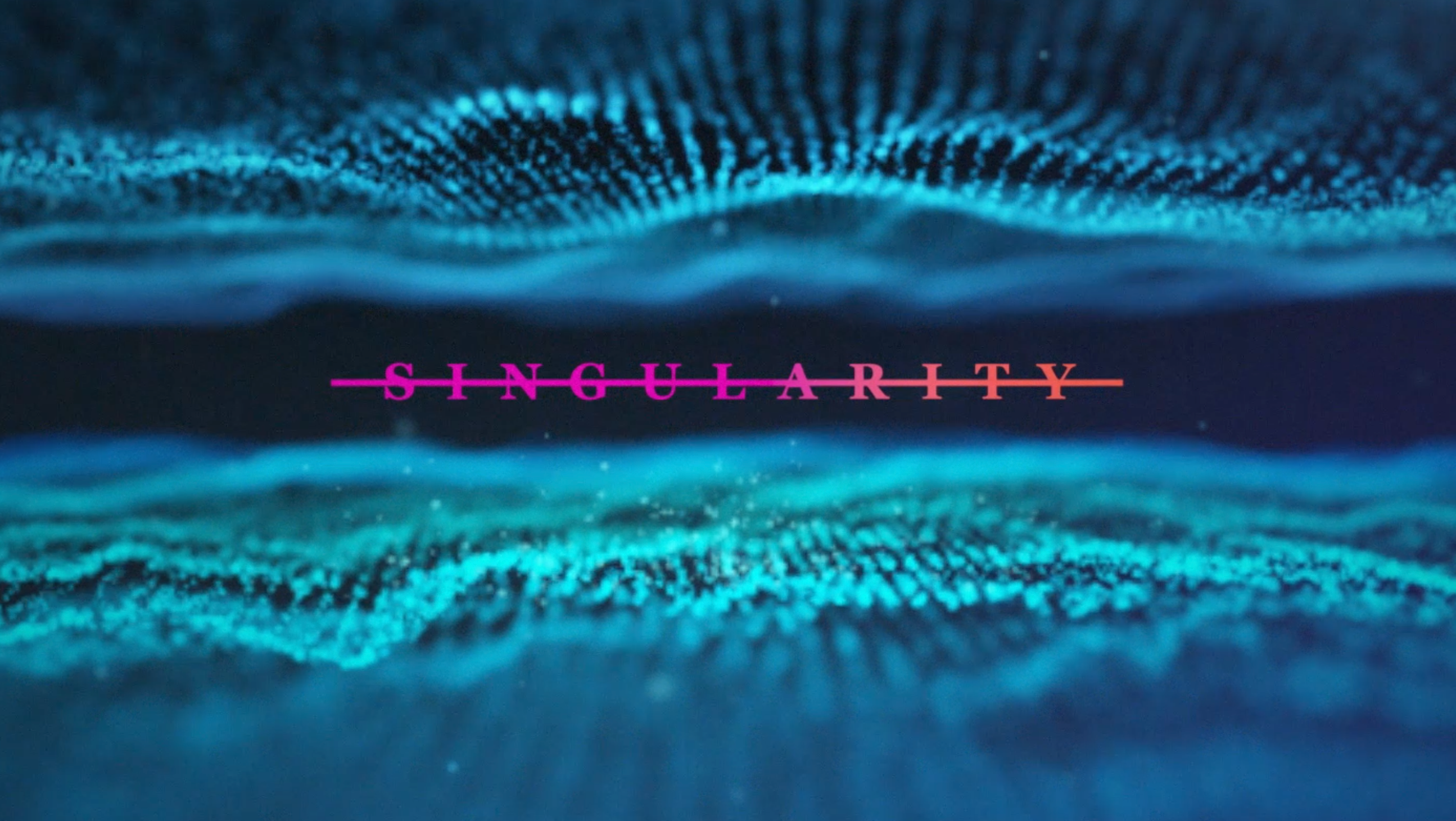
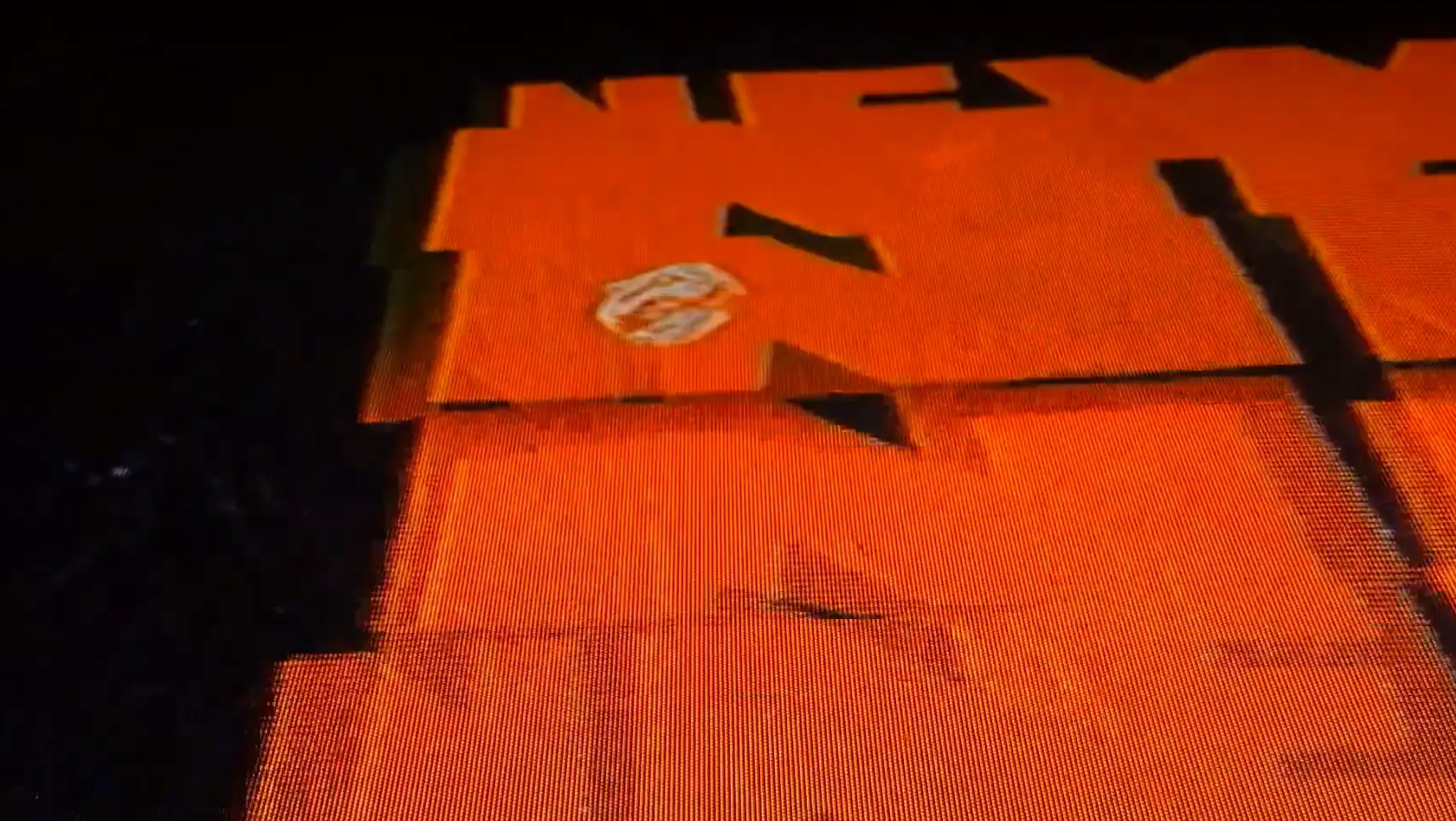
This independent film production company, founded by writer and director Jacob McAllister, is a nod to the gritty and raw pulp cinema of the 60s and 70s. That sentiment is reflected in their production logo, featuring visual aspects of low-budget film and a distinct production aesthetic. The logo itself is equally timeless and dated, featuring a bold and striking font that contrasts with the dark fluidity of the image. The animation is accompanied by an unsettling and atmospheric soundtrack that captures the raw energy and authenticity of the era.
A U D I O
Mixed by yours truly
S O F T W A R E
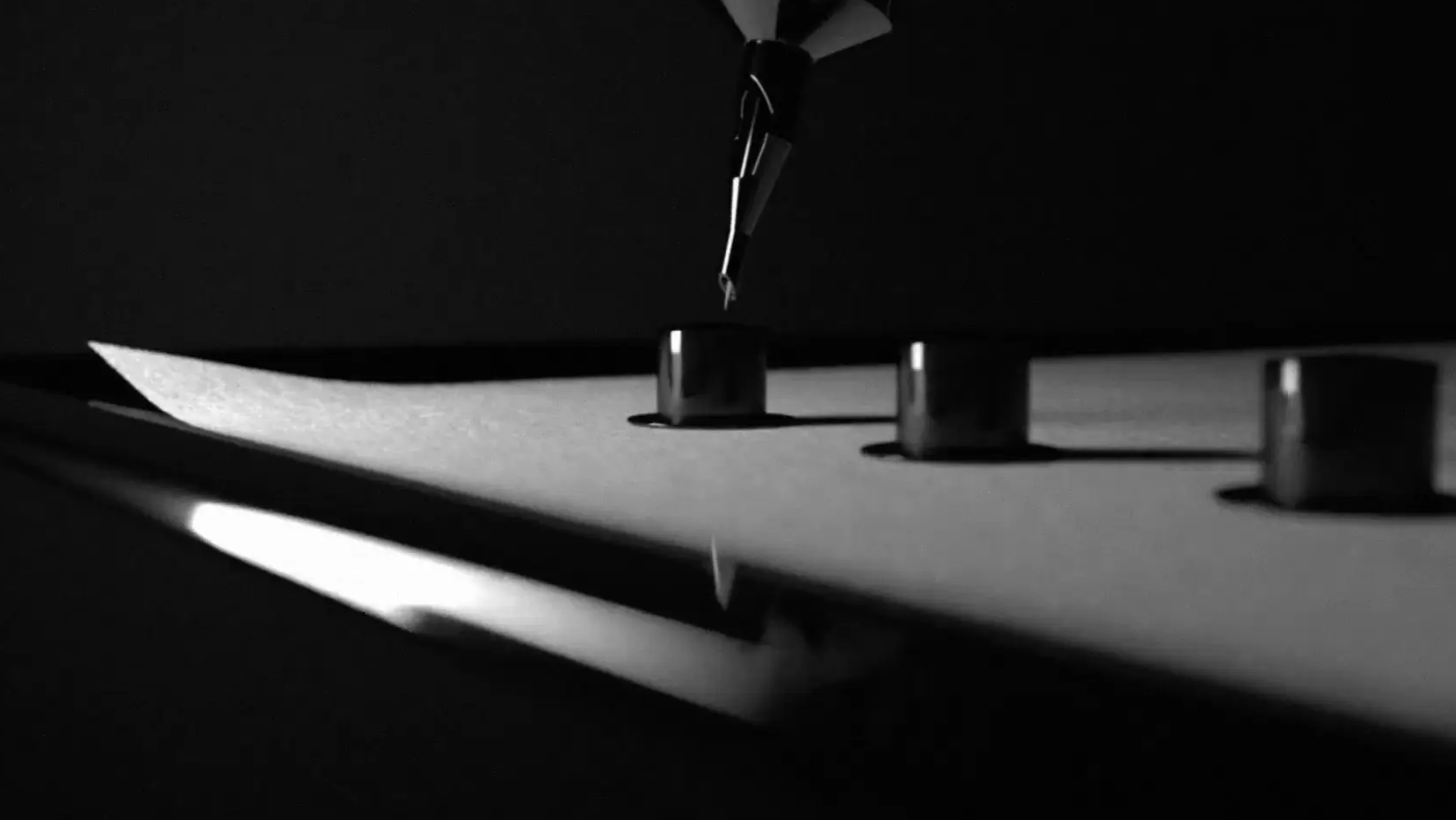
Practical effects / After Effects
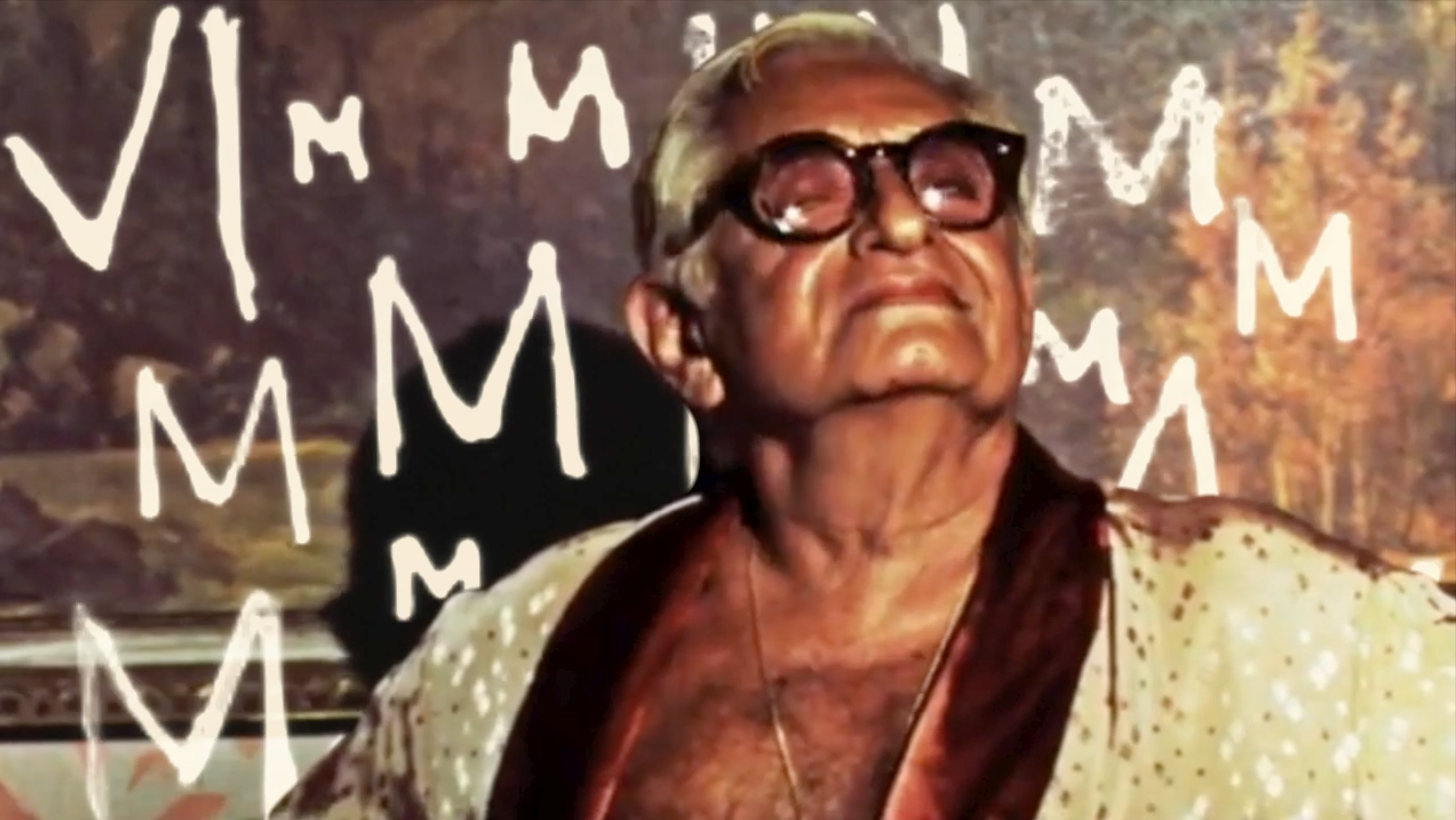
P r o c e s s
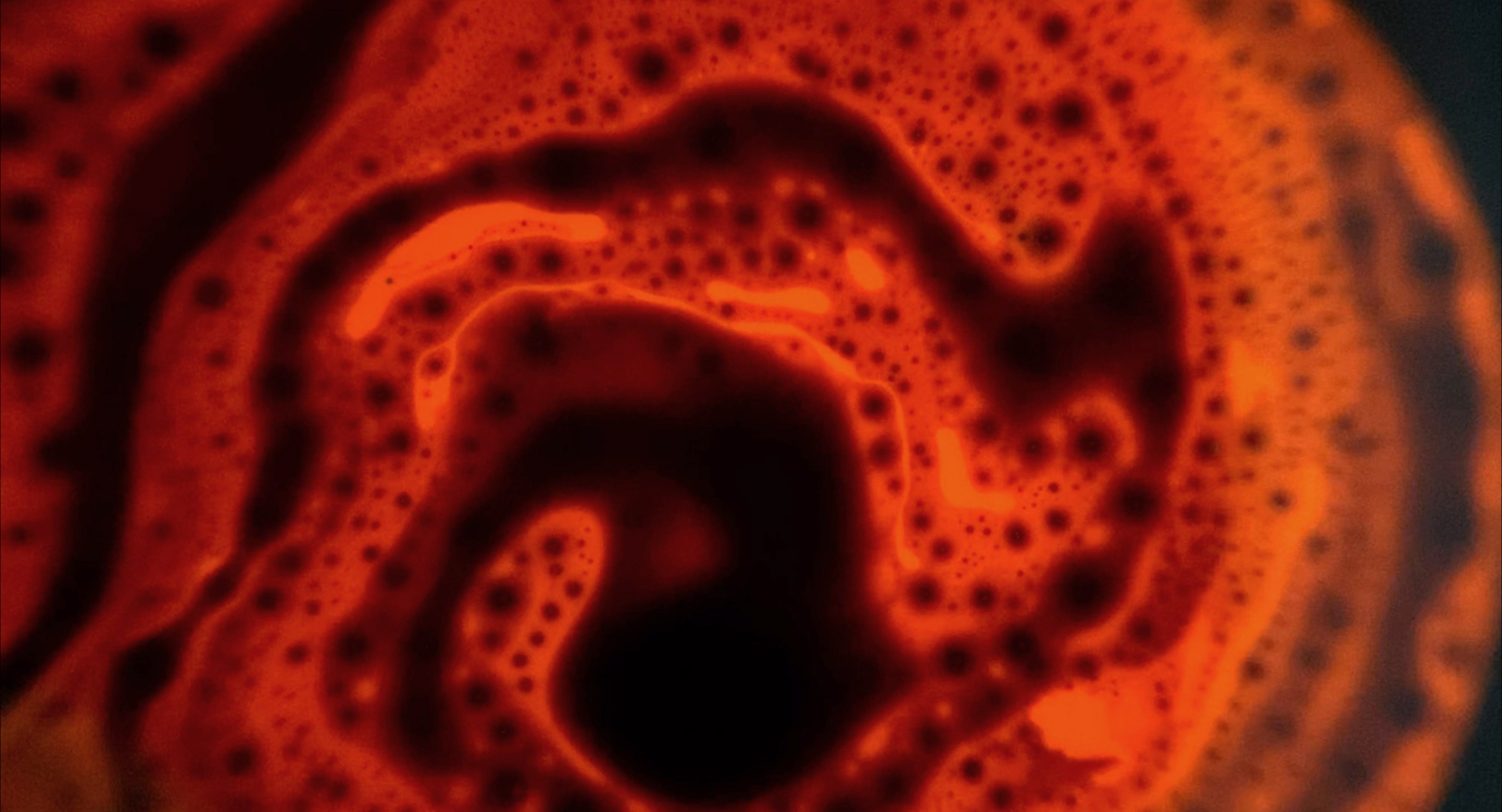
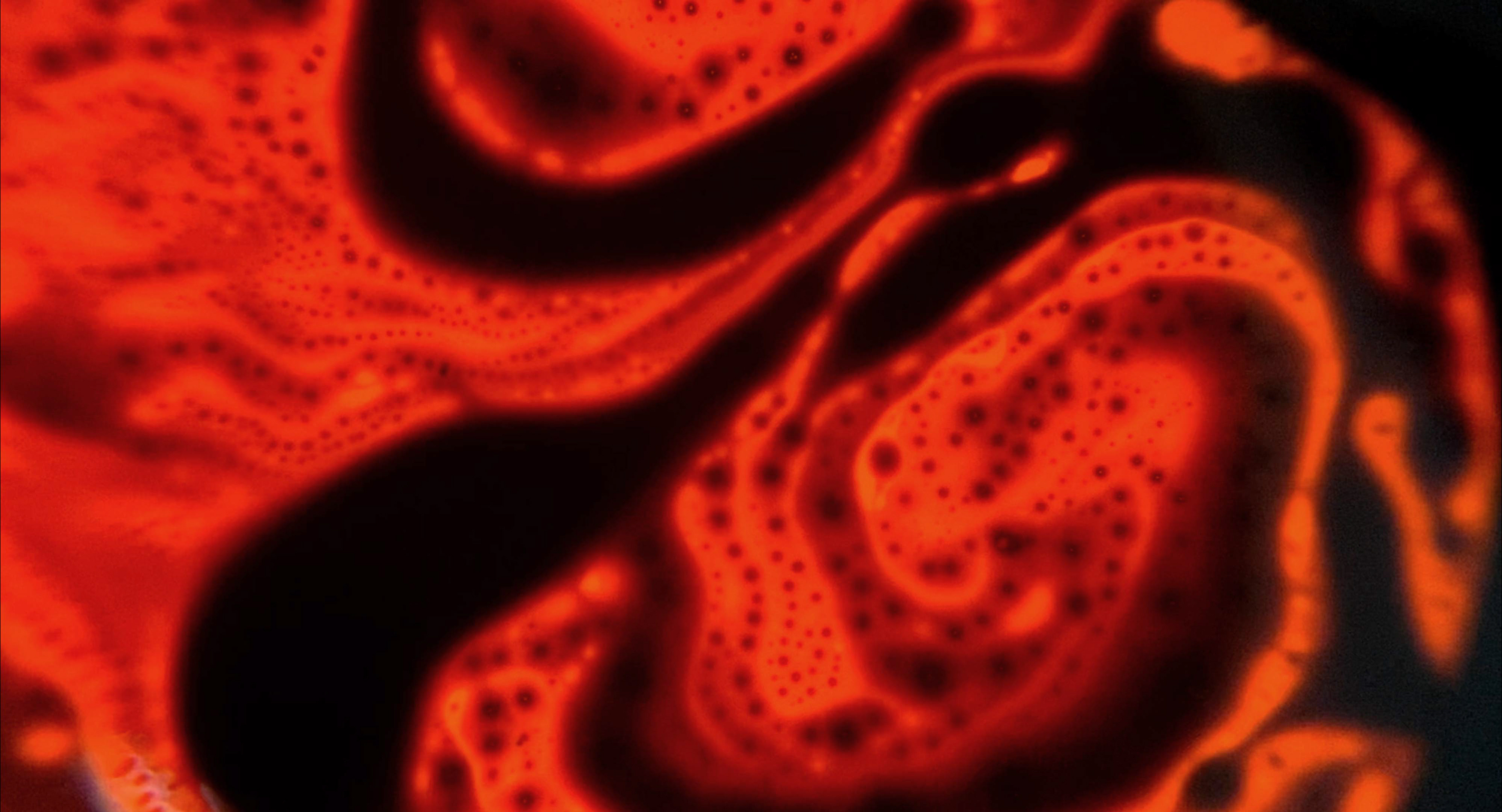
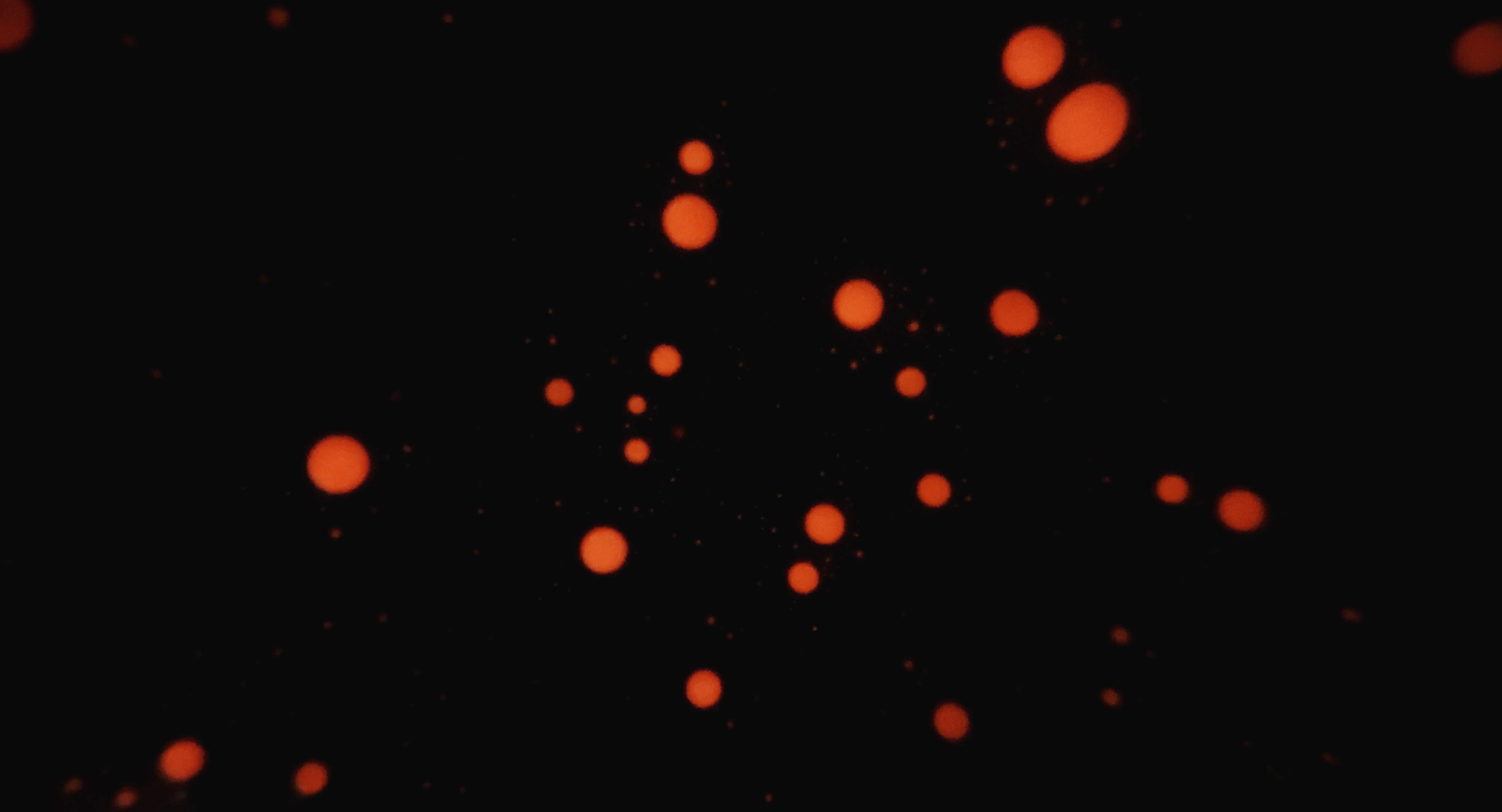
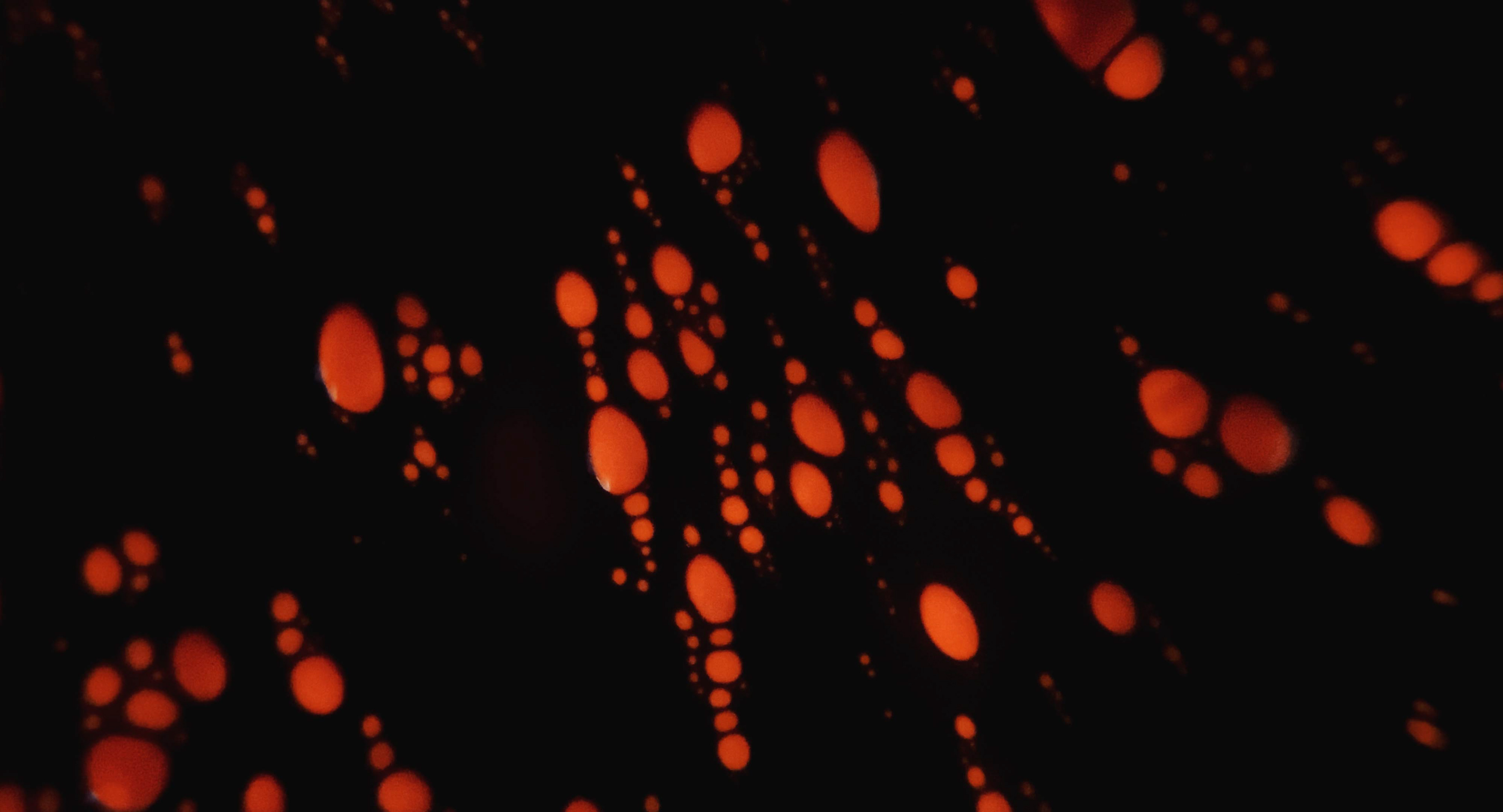
To achieve this, I looked to the early liquid light shows of the 60s, which used a combination of colored oils, dyes, and other liquids to create hypnotic and psychedelic visuals. I was particularly drawn to the way these shows played with light and color, creating a sense of fluidity and movement that was both mesmerizing and disorienting.
To update this old-school technique, I experimented with ferrofluid- a magnetic liquid that can be manipulated to create unique forms and patterns. By combining this alien-like goop with the retro vibes of the liquid light shows, I aimed to create something that was reminiscent of the era, while also having a darker, grungier edge.