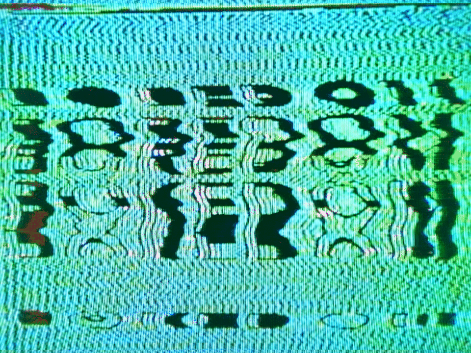
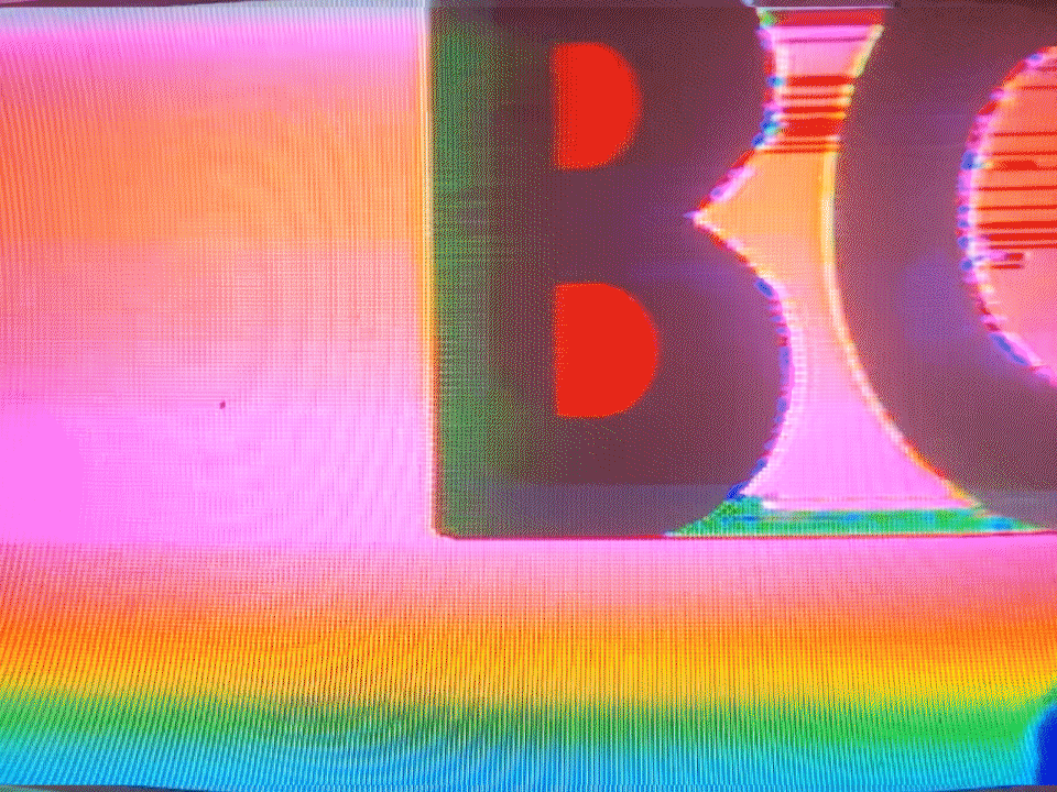
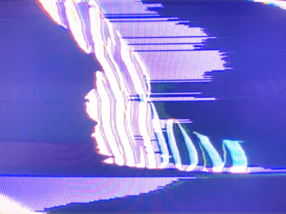
B o r e d o m | 2 0 2 0
Boredombordeomboredombordeomboredombordeomboredom bordeomboredombordeomboredombordeomboredombordeom boredombordeomboredombordeomboredombordeomboredom bordeom boredom.
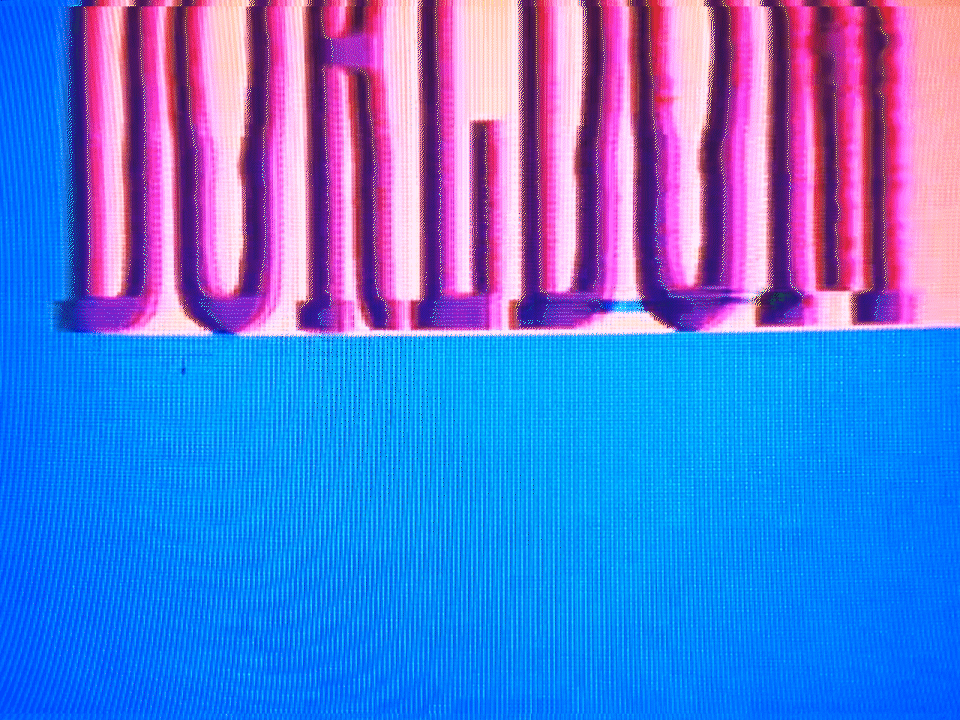
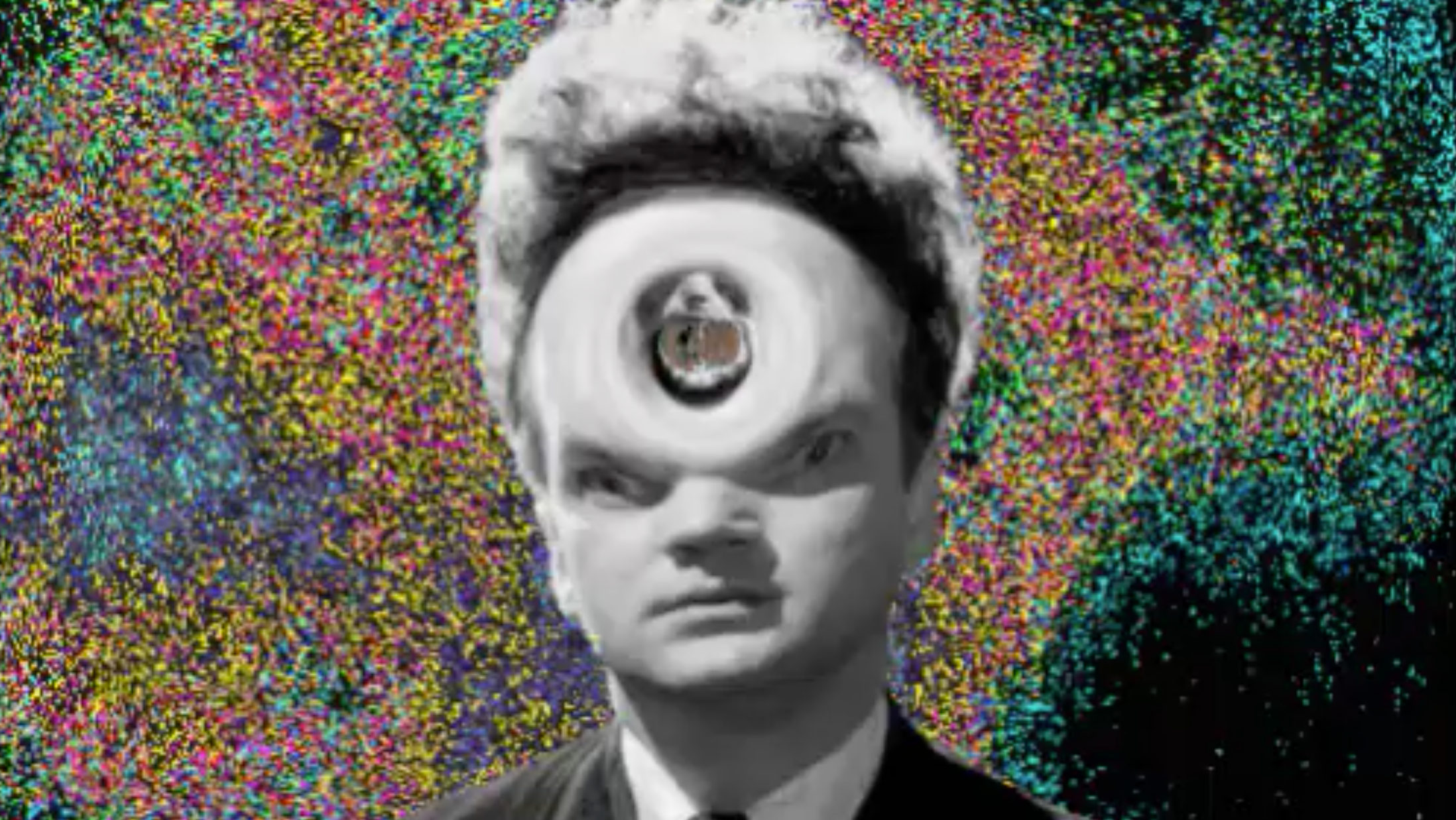
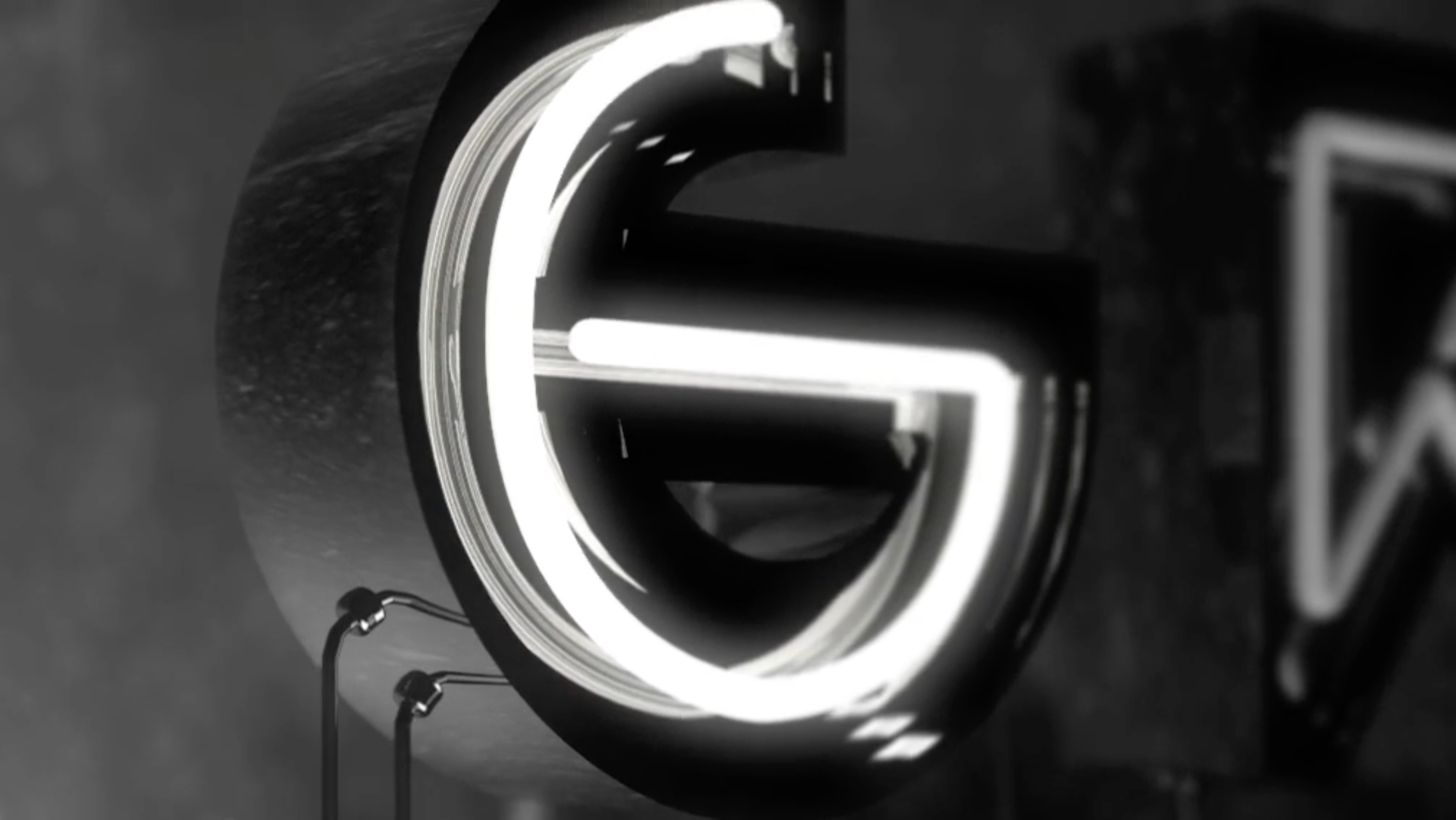
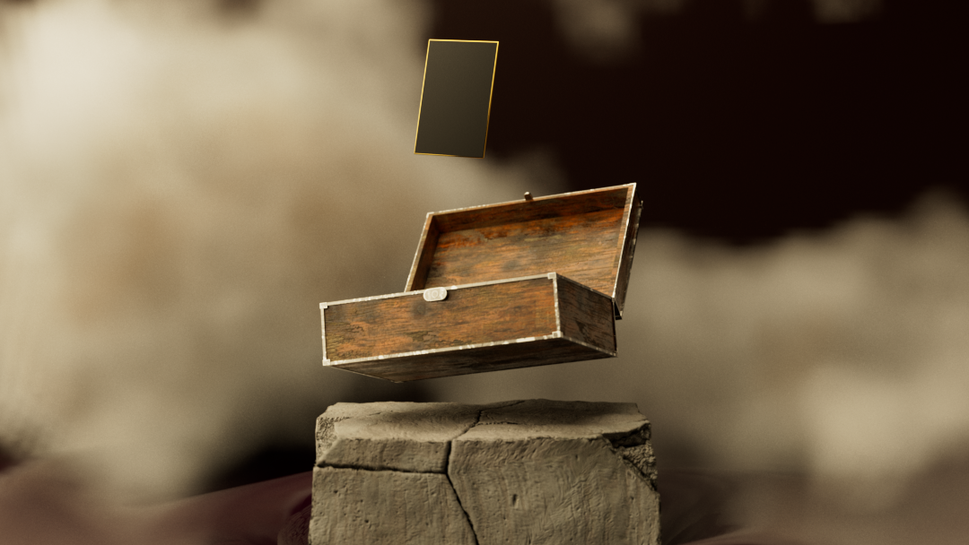
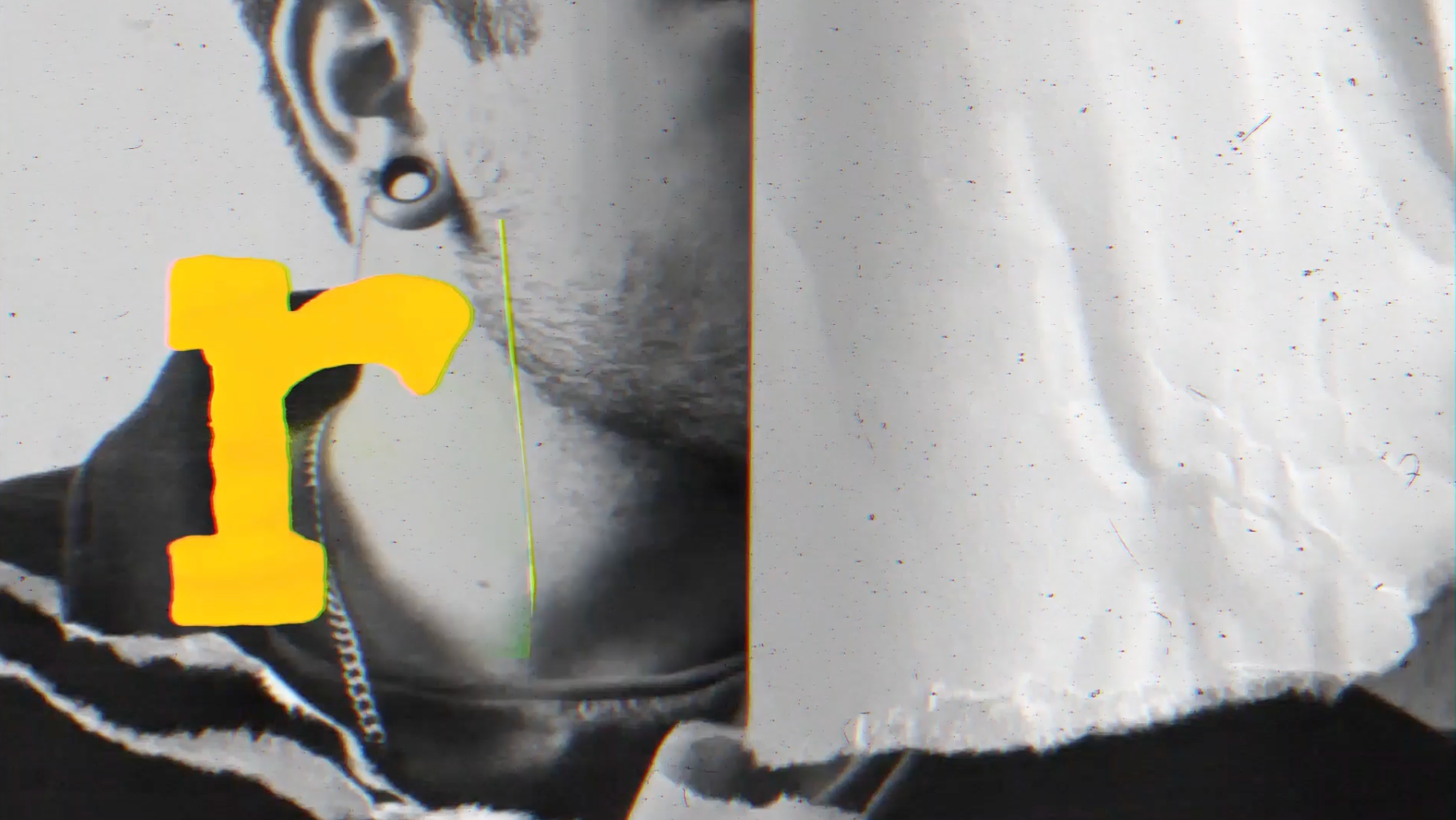
During a period of intense boredom, I decided to experiment with the movement and animation of typography. Rather than treating it as an afterthought, I wanted to explore how letterforms could be used as the centerpiece of a visual design. While I love slow drifting minimalist letterforms just as much as the next guy, it does tend to get boring. But by dissecting the anatomy of type, exploring how it flows and moves, my aim was to animate interesting and dynamic frames that challenge the traditional role of typography.
A u d I o
Boredom - Tyler, the Creator (& Friends)
S o f t w a r e
Practical effects / After Effects / Audition
V a r i a t i o n s